A mobile app acts as a smooth connector between the physical and the digital world. It is developed for consumer convenience and to make functioning simpler and smoother.
An ideal mobile app is expected to be-
- Simple and Easy to navigate despite minimum technical knowledge
- Clean while symbolizing the colors of the Brand
- Good scalability and a soothing appearance
- Having an intuitive UX and good Privacy options
- Well-built in terms of safety and security
- High speed and high functioning capacity with less to no lagging time
and the list goes on!
The Microsoft Dynamics 365 for Phones App ticks all the above boxes and more. Maplytics, the preferred 5-star rated geo-mapping app on the Microsoft AppSource, can be accessed and utilized within the Microsoft Dynamics 365 for Phones App. It empowers businesses with the power of Location Intelligence and geo-analytics. Team Maplytics is on a constant go to keep updating and upgrading the look and feel of the Maplytics section in every possible manner to enhance the user experience.
Recently, the Maplytics Logo and the Website were re-introduced in an all-new avatar in new brand colors. Of course, Team Maplytics had to sync these upgrades with the Mobile App! Hence, the September 2022 release of Maplytics saw an improved form of its mobile app as well. Let us have a deep dive into the improved look and functionality!
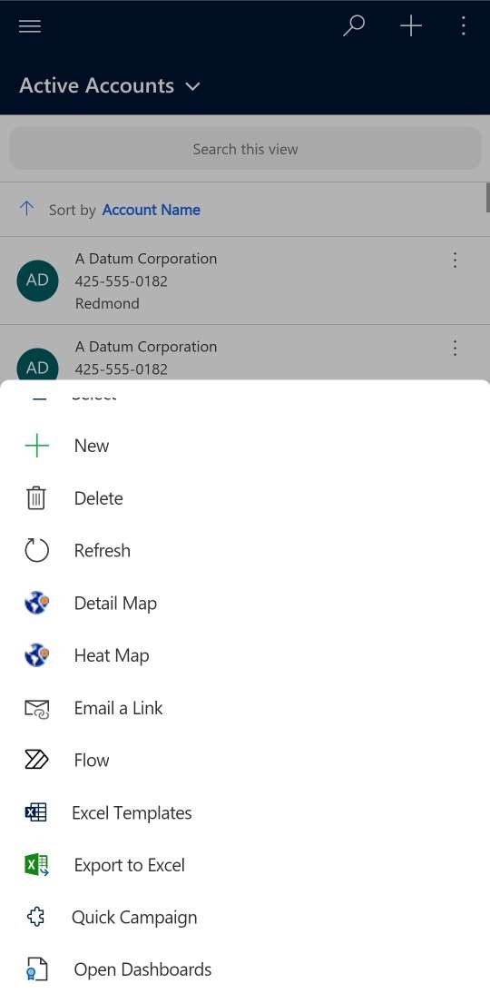
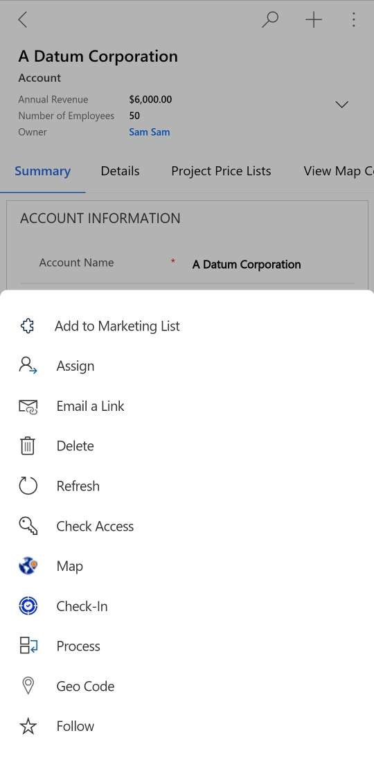
Detail Map, Heat Map, Map Buttons
Users can use the ‘Detail Map’, ‘Heat Map’, and ‘Map’ buttons from the main menu in the ‘Accounts’ section on the dashboard to utilize the features of Maplytics on their mobiles in the following manner
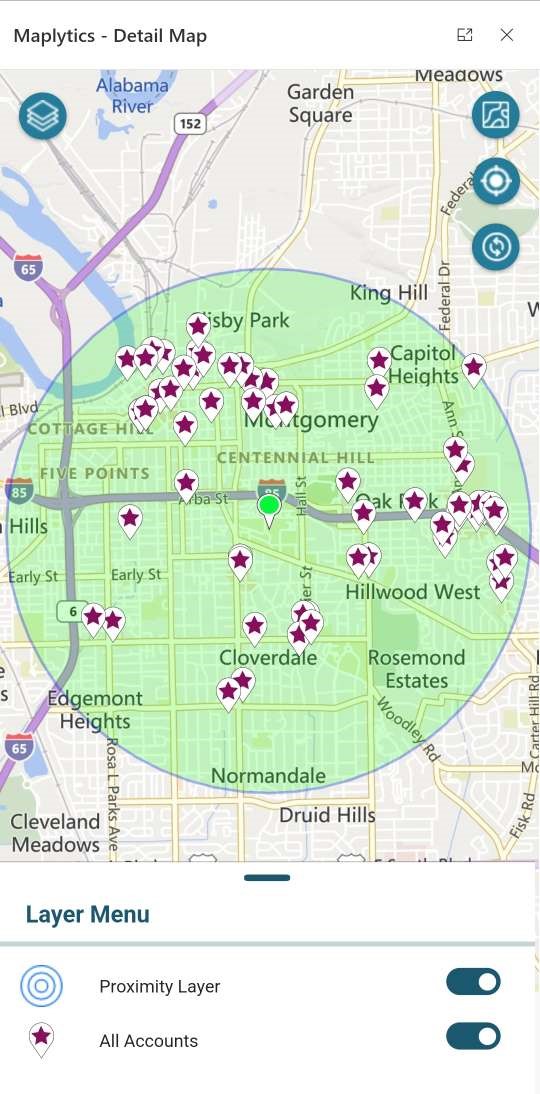
Proximity/ Radius Search
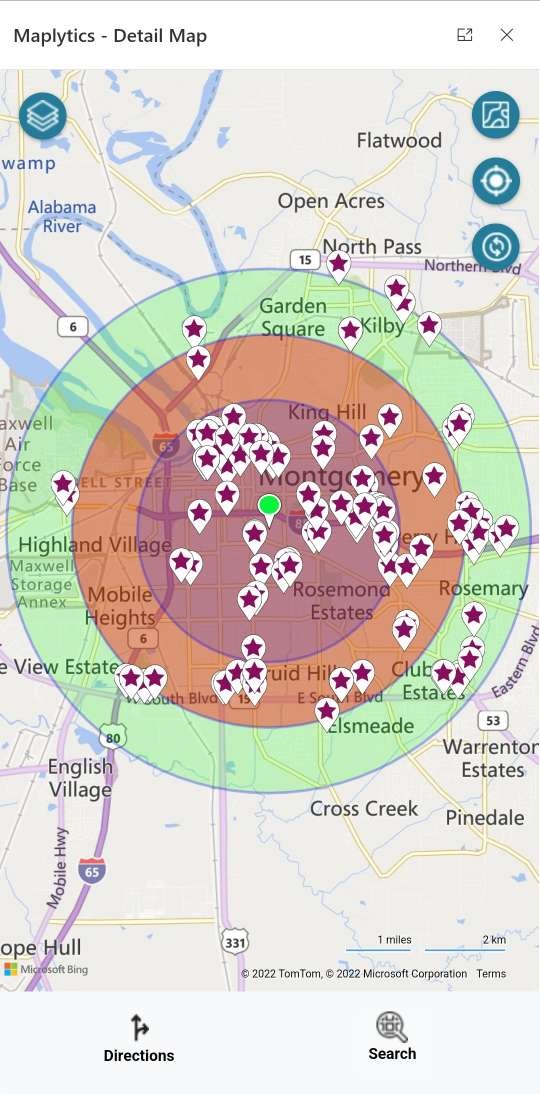
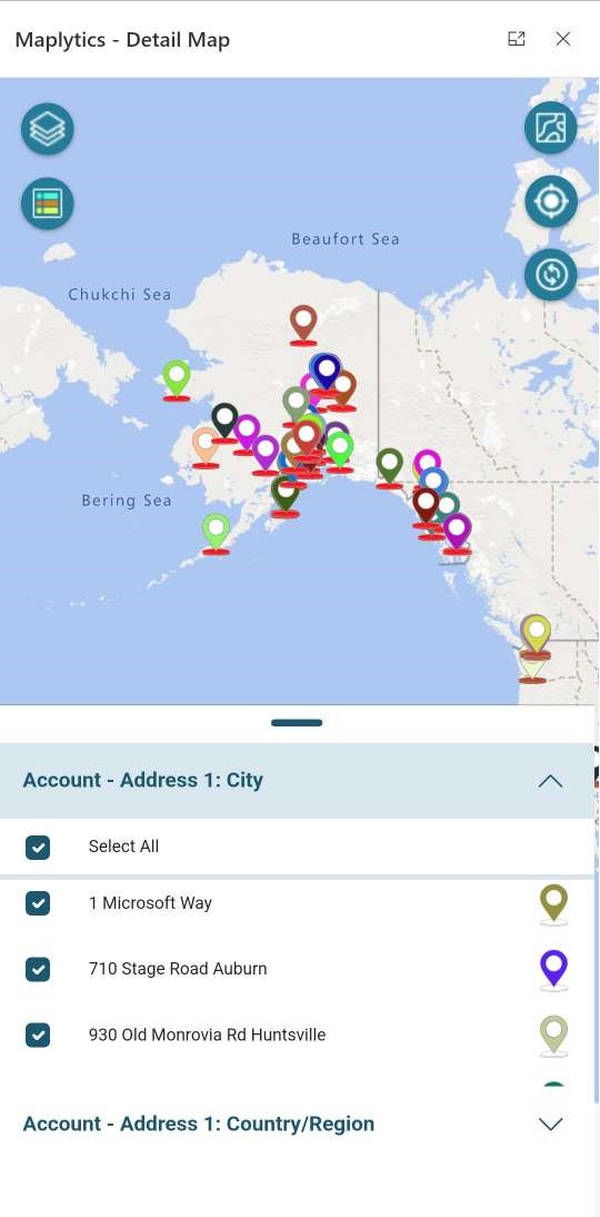
The client records with the help of a radius can be plotted using the Radius Search or the Proximity Search feature within Dynamics 365 CRM. The Layer Menu is displayed on the Map, at the bottom and can be enabled from the button at the top left corner. Any of the Layers can be enabled or disabled.
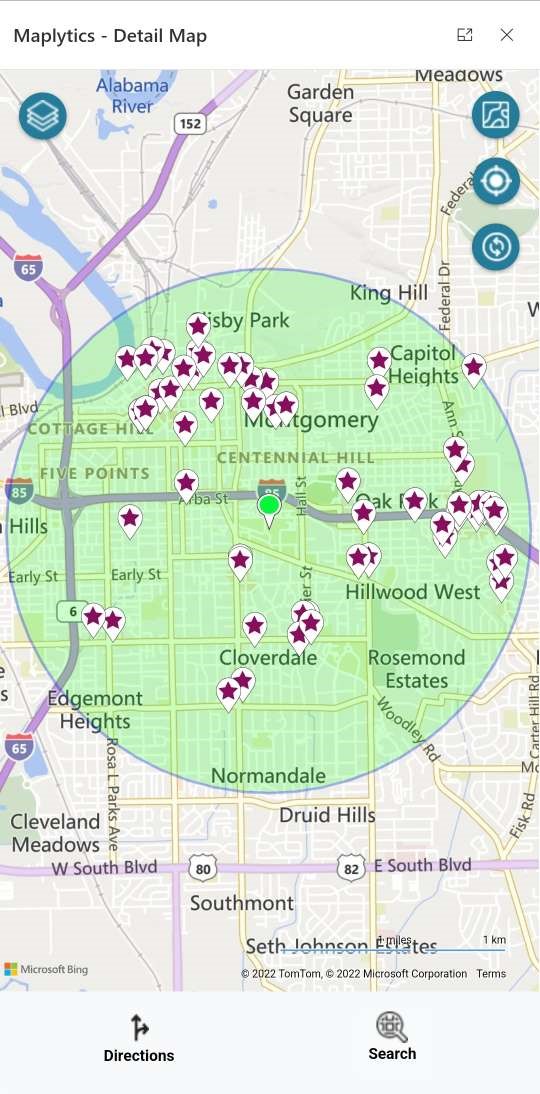
The Directions and the Search button at the bottom are entry buttons to several other functions. To keep the UI neat and less cluttered, all the functions are hidden under these two buttons.
The icons on the right act help in refreshing the map, detecting the current location of the user, and changing the Map view from Road to Aerial.
The colors of the icons represent the new brand colors of Maplytics. Concentric Proximity Search can be utilized in the same manner.
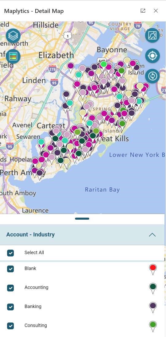
Category Filter
Users can categorize the data based on an attribute of the Entity. The categories are represented by the new Category Filter icon on the left below the Layer Menu icon. Any of the category options can be disabled to change the view.
Set GPS Location as the current location
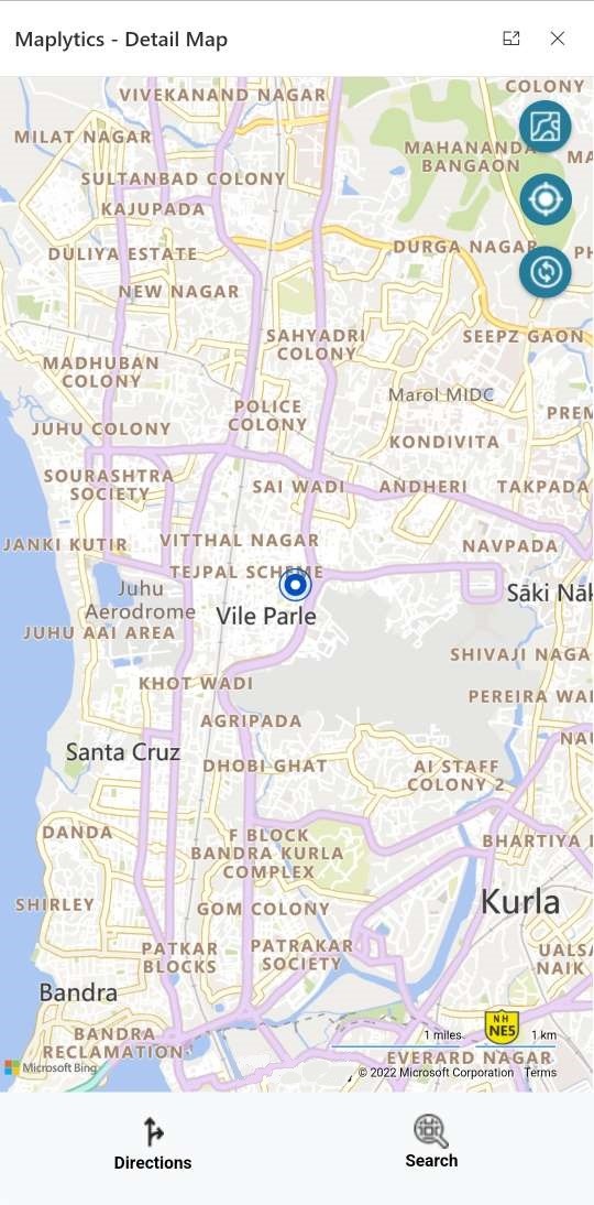
The user can also locate the GPS location of phone devices using the button. The mobile location needs to be enabled for this action to be complete.
By default, the ‘Current Location’ field displays the address stored in the Maplytics Personalized record of the logged-in user.
Tooltip Card
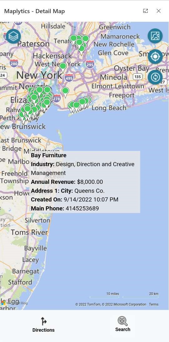
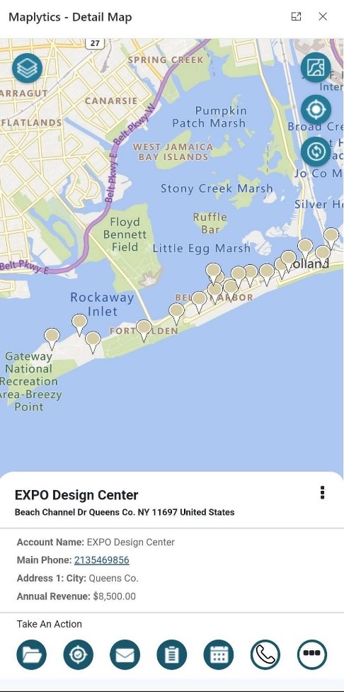
Every Pushpin will display the record name, and address, as well as the contextual data defined in the tooltip section of the Maplytics Configuration when double-clicked on the record. The user can open the record, check-in/out, and perform other actions using the available quick actions button.
A double click on any push pin opens up its Tooltip card.
Contextual Menu
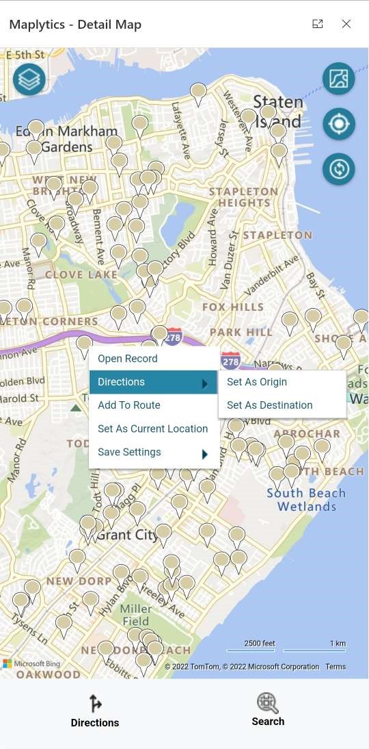
To get a contextual menu on the map, long press anywhere on the map. Pushpin Contextual menu provides the following additional options. These option provides commonly used features in Maplytics like Set as Current Location, Origin, and Adding to Route, etc.
A long press on a push pin enables the contextual menu.
Set As Origin:
Selecting this option will set the address of the pushpin as the start location of the route to be plotted using the Optimized Routing Feature
Set As Destination:
Selecting this option will set the address of the pushpin as the end location of the route.
Add to Route:
This option will set the address of the pushpin as a middle waypoint of the selected route. For example, if the users already have Point A and Point B selected as their route, and click on the Add To Route option, then Point B will become Point C, and the address of the selected pushpin will become the Point B of their route.
Set As Current Location:
This option is used to set the address of the pushpin as the current location, which can be used for proximity search. For example, if the user wants to plot all the leads that are within a radius of 100 miles from a particular record then the user can click on the Set As Current Location option to set the address as the current location and then the user can plot the records around this location.
This option also removes the additional step to type the current location manually for the proximity search.
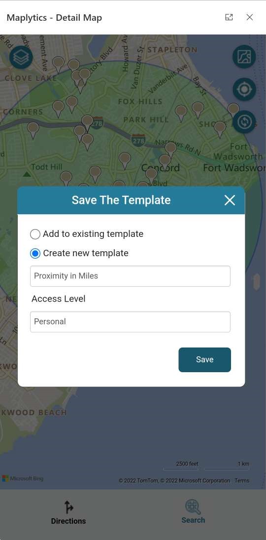
Save Template:
Users can save the plotted search criteria as a template, to open the template directly instead of searching on the map again. This gets available by clicking the Directions button at the bottom.
Optimized Routing
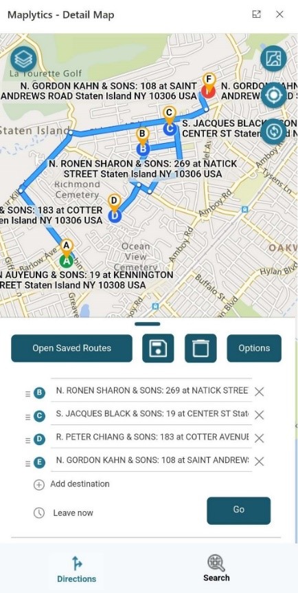
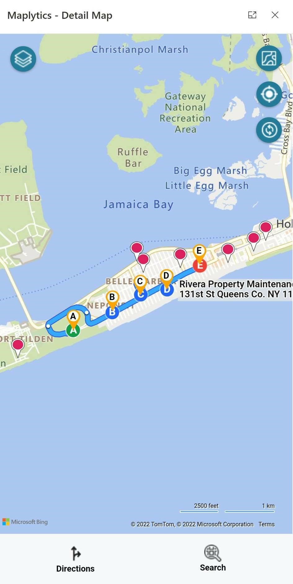
Another essential feature of Maplytics is Routing across multiple waypoints. Using the Contextual Menu options, the users can add multiple waypoints to their journey.
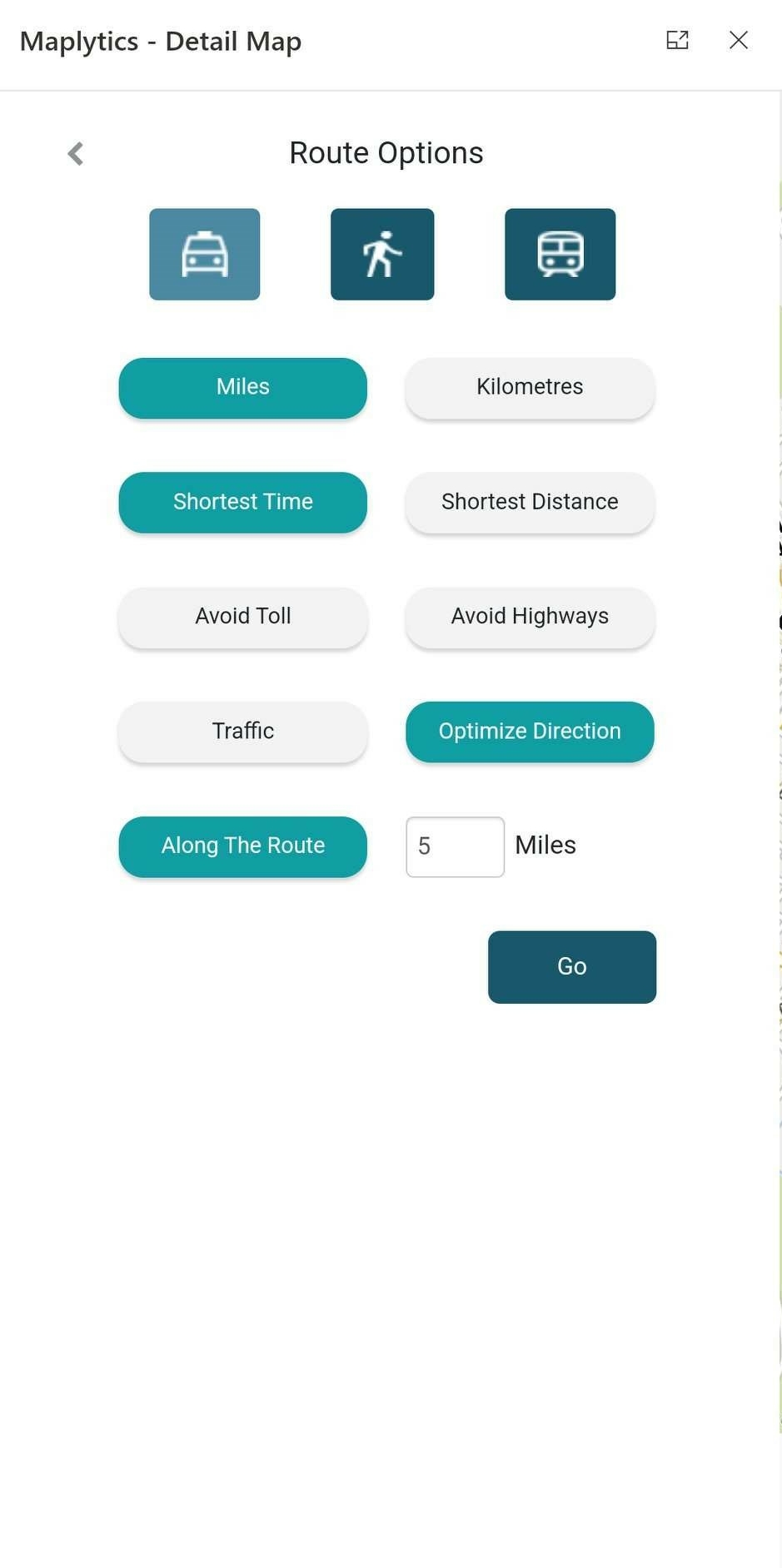
The Directions icon at the bottom left of the Detail map screen leads to the routing screen. Once multiple waypoints have been added, click on the Go button to bring up the Optimized Route on the Map.
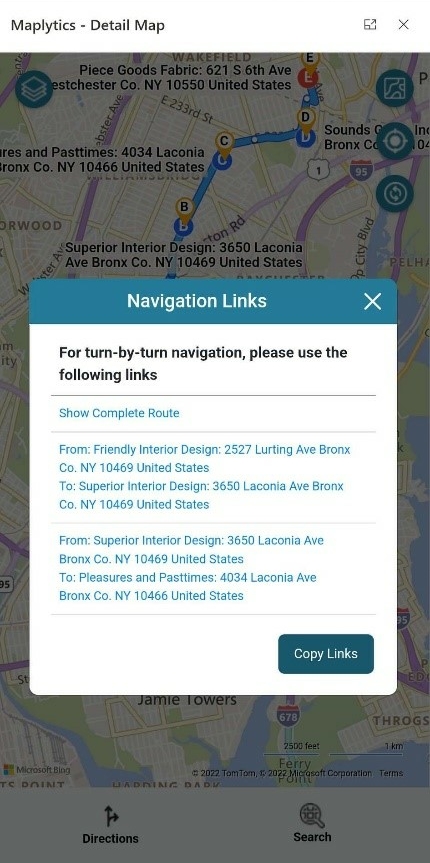
Users can redirect the travel with detailed directions on Google Maps or the Waze App
Save Route & Plot Saved Routes
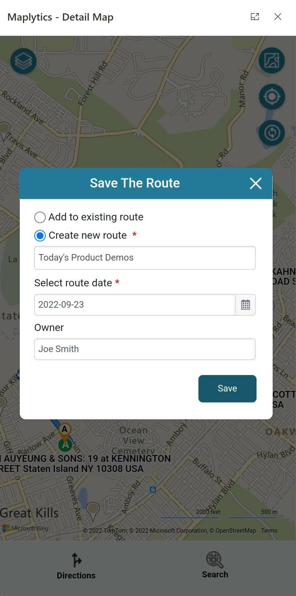
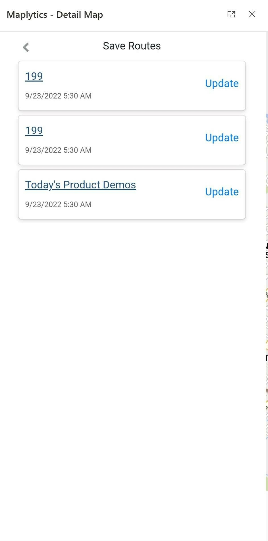
Users can now save the route from the Microsoft Dynamics 365 App for Phones and Tablets and later use the ‘Open Saved Route’ feature to plot the saved routes. These saved routes can be plotted again as well as updated and saved for later use.
The saved routes are visible in the form of a list with distinct names and can be selected easily. Each route is owned by a specific rep.
Along the Route Search
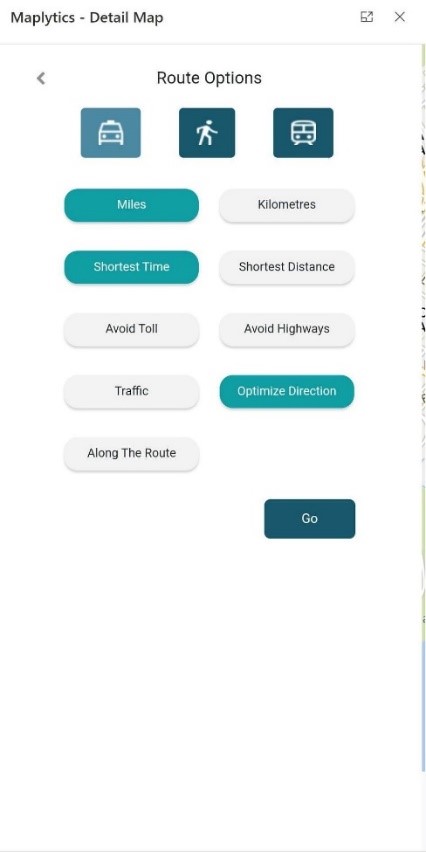
The user can search the records along the route in the app, the same way as on the Browser by selecting the Along the Route option in the Routing Screen. The miles can be specified on the Routing Options screen and all the records up to that number of miles get plotted on the Map.
Visualization Dashboards on Mobile
The users can define their Dashboard views for Maplytics and include them as web resources in standard Dynamics CRM Dashboards. Maplytics ships with 6 pre-defined Dashboards for various Sales and Service Modules for different user roles.
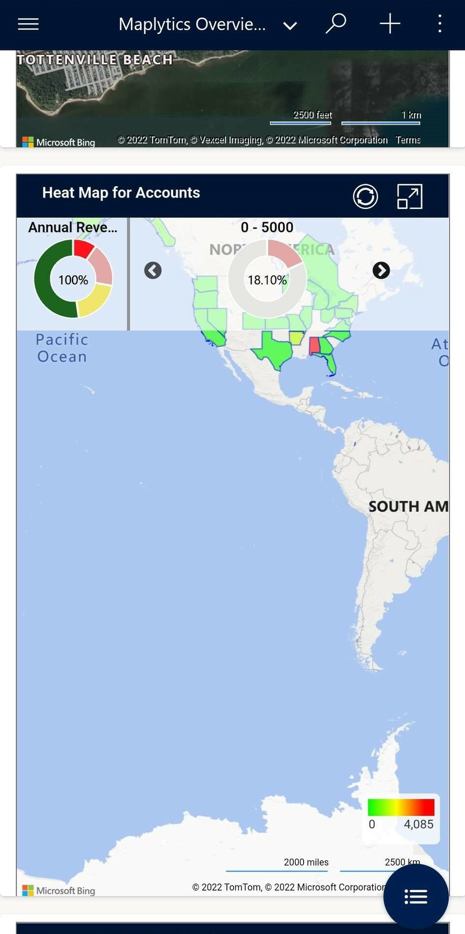
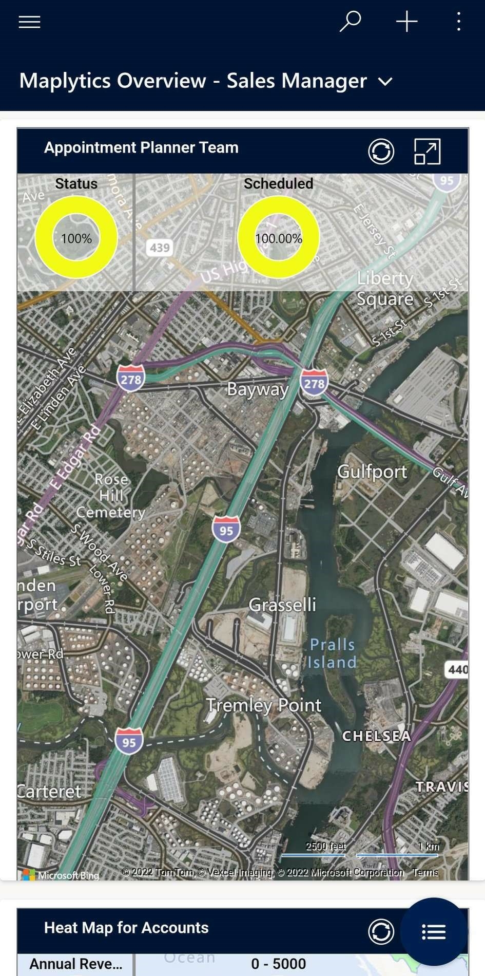
Users can now view the categorized data in the form of donut charts on the respective dashboards. The feature is available for both Detail Map and Heat Map and allows a choice of ‘measure’. By default, ‘count’ is the measure for display which could be changed to any of the category options. For an account entity, with Detail Map and revenue selected as the Map Type and the Measure, the donuts are displayed below.
In this VUCA World, change is the only constant, and not just the appearance but also the functionality of an App needs to be upgraded constantly for it to remain relevant. Team Maplytics will continuously keep working on amazing and advanced updates in the near future. So, stay tuned!
In the meantime, to learn more about Maplytics, its applications across versatile industries, and other gripping functions, do visit our Website or the Microsoft AppSource. For further details, you can hop on to our Blogs, Client Testimonials, and Video Library.
Do write to us at crm@inogic.com for more information on Maps for Dynamics 365 CRM, a free trial, or personalized demos.
Till then,
Happy Mapping!

