“Okay Jen, calm down, take a deep breath, and look at me. I am here to help sort your problem, okay?”, Jenna asked skeptically. “Yes, Yes!, I’m calming down. I’ve to be the best, just show me how to use Maplytics to improve my sales pitch,” Jen blurted whilst taking deep breaths.
Jen was a new sales executive at Maddison World, new to the technic of digital sales pitches, and was stressed about her first sales pitch. Jenna, her senior had graciously agreed to help Jen out that fateful night as she was a pro at using Maplytics within Microsoft Dynamics 365 CRM for creative and concise Sales pitches.
“Tell me the 3 most critical parts of your presentation”, Jenna asked. “I’m done with the slides and to show the actual numbers, I shall be switching to Maplytics as it would be easier to understand a visual representation of data, locations, and other facts and figures”, Jen answered. “I want to know how do I show the concentration of major annual revenue zones for the clients in the same industries without throwing actual numbers”, she added. “Great! Sounds like a plan to me. I think Heat Maps could be helpful in this situation”, Jenna pointed out.
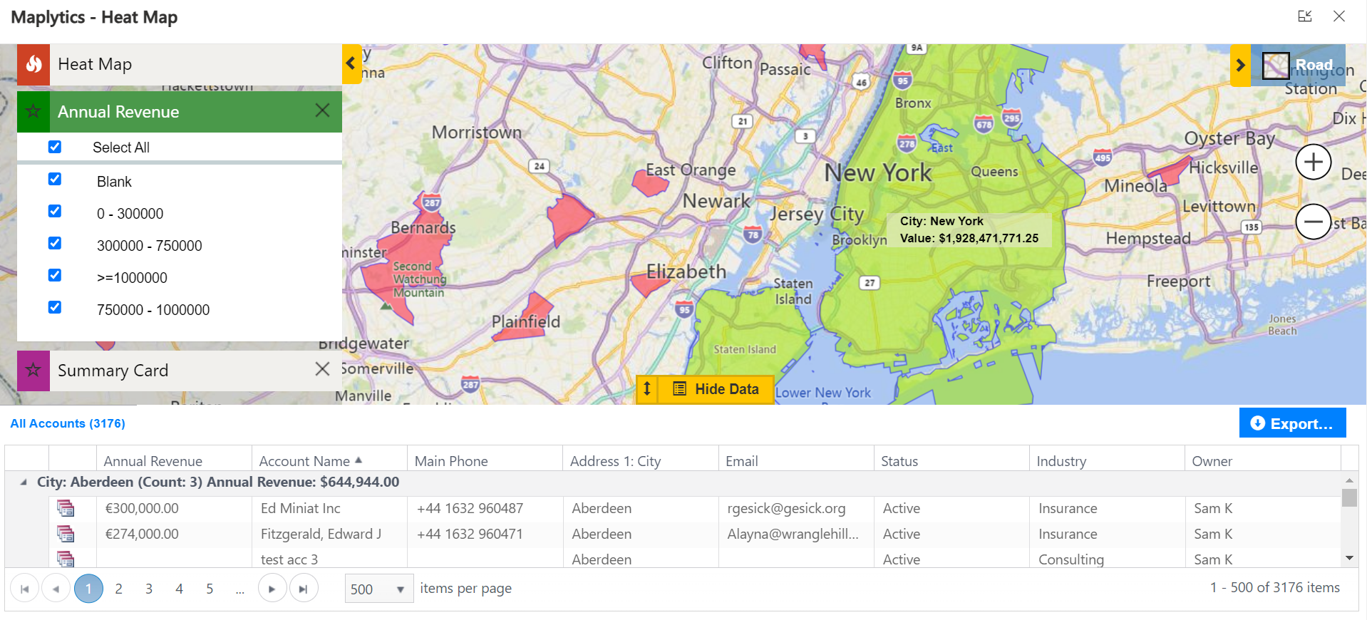
Both switched back to the laptop and Jenna continued showing the way around Heat Maps. “Now, we want to display that the revenue generated in and around New York for a similar product has been immense whereas the same in a different city and been almost nothing, right?”, Jenna confirmed. “Yes! The cities outside NYC have been a lost cause in fact and I do not want the clients to waste their time there”, Jen clarified. “Right! So, we shall show the concentration of revenue with boundaries like this-
Here, the revenue for NYC is in 10 figures, and that in the city of Aberdeen in Scotland is in 6 figures. You can move the map around and show the green patches with good revenue, yellow with average, and ref with low”, Jenna said. “Okay, this seems easy. I can show this and also explain well”, Jen look a bit relieved.
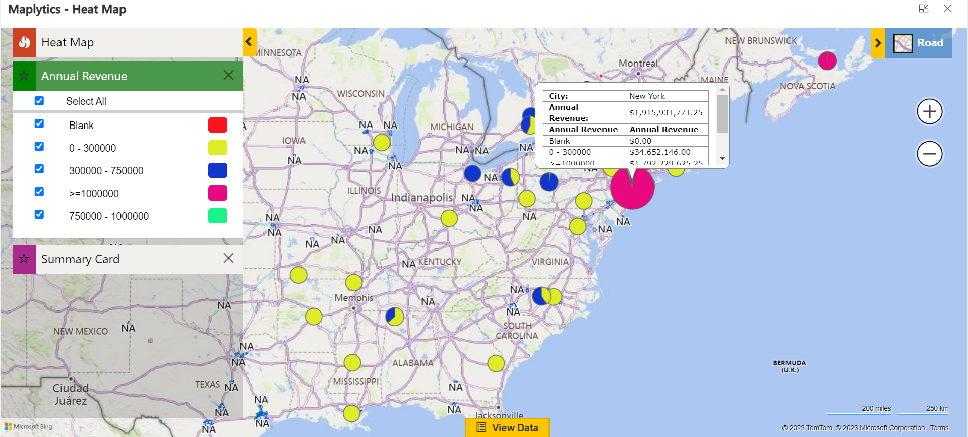
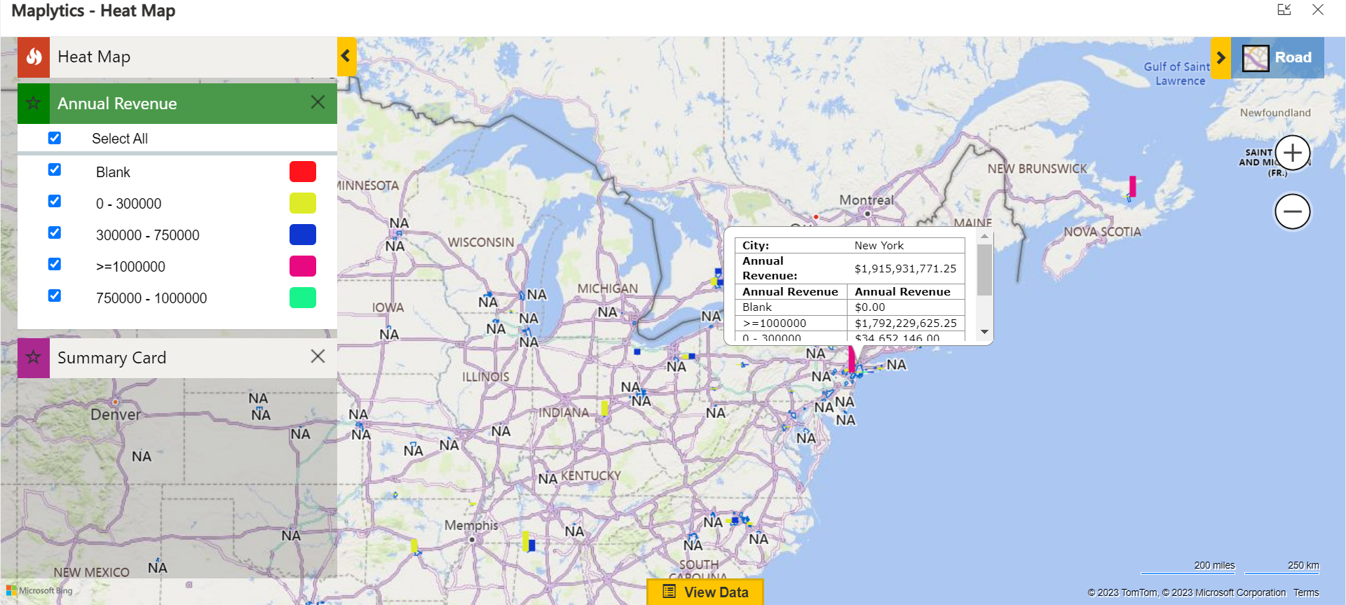
“If the color legend seems complicated, you can display the same info in the form of Pie Charts or Column Charts. Same data, different representation.”, Jenna added.
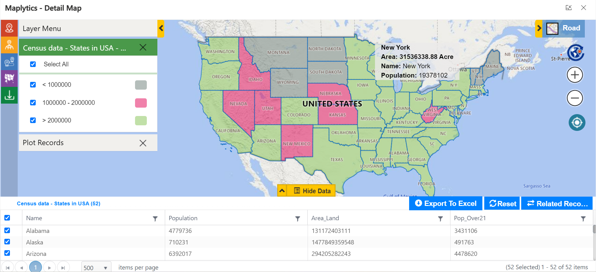
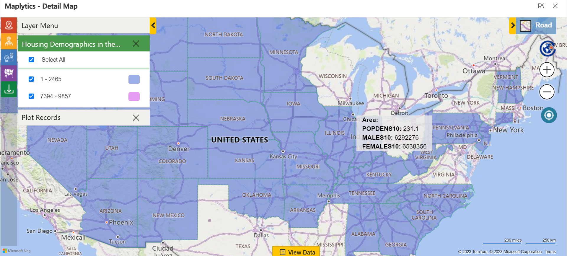
“I got this. This is great. Can I also show the concentration of demographics like this? I want to suggest the densely populated cities with a population over 21 years as their current focal point for expansion”, Jen spoke. “Oh well, you can use the Overlay option. We can directly overlay a file with the Census data and the color profiles shall categorize as needed”, Jenna answered.
“This would be easier and neat to differentiate. Plus the numbers are at the bottom, so, the client can refer those too”, Jen said happily. “Can I also show the sex ratio of permanent house owners like this? Is the census data reliable for it?”, she asked. “Well, you can use the real-time feature layers hosted by ESRI’s ArcGIS in that case. The data is updated in real-time. So, it’ll show you what you want to see!”, concluded Jenna.
“With this layer, you can show the division and the density of home owners. Do you feel a bit more confident now?”, Jenna asked. “Yes! A million times more. I think I get this now. Let me just practice and I can switch through the presentation and also present live data with their impromptu queries”, Jen answered.
Well, we hope Jen rocks her sales pitch and bags her client!
What’s More?
The unique features of Maplytics could be experienced when explored more with a trial. One can write to the Team at crm@inogic.com for mapping requirements, a free trial of 15 days, or a personalized demo within Microsoft Dynamics 365 CRM / Dataverse.
To learn more about Maplytics, its applications across industries, and another multitude of features, do visit the Website or the Microsoft AppSource. For further details, one can hop on to the Blogs, Client Testimonials, Success Stories, Industry Applications, and Video Library for a quick query resolution.
Until then,
Happy Presenting!

