Maplytics (Preferred App on Microsoft AppSource) gives its users the ability to use a shapefile overlay in their maps. The shapefile format consists of geographical data that includes additional metadata for the given domain. Therefore, Maplytics allows you to overlay your Shapefile data and its associated metadata with the geographical boundaries defined by the shapefile.
In this blog, we will see how to create a shapefile overlay and then configure it. If any organization has data with the file extensions of .shp, .kml, or .geojson, they can upload this file and visualize them on the Detail Map. Also, they can further drill down CRM data based on a plotted overlay.
To create an overlay record, first you need to create a territory record and save it.
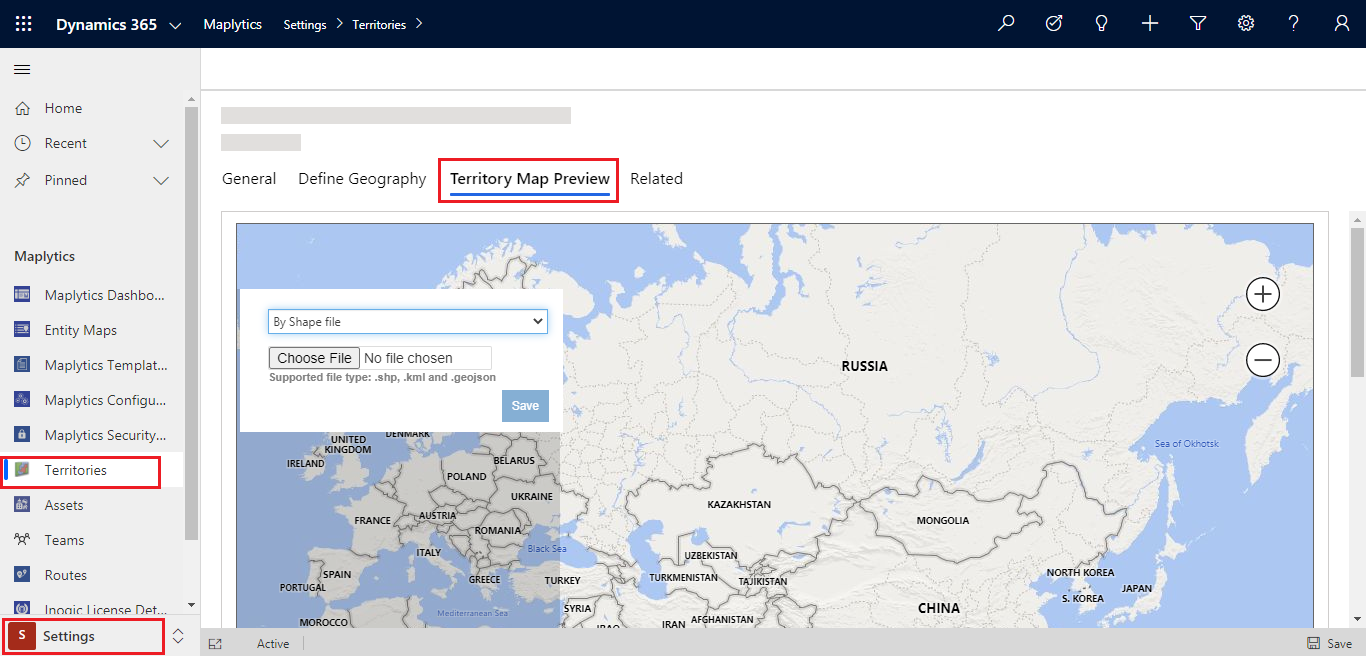
Go to Settings > Territories > New > give the territory a name and save it.
Once you create the territory record, go to the ‘Territory Map Preview’ tab as shown below, choose the shapefile and click on Save.
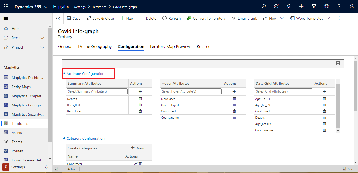
Once you have successfully saved, the shapefile Configuration tab will be displayed. Click on the Configuration tab, here you will see a lot of options to configure what kind of data you want to see on the tooltip card, on hover, and in the grid. Also, you will get an option to create a different category for shapefile attributes and color code them as per your choice.
Attributes configuration
In each shapefile, some metadata might be important while visualizing them on the map. To visualize geographical shape along with which metadata of shapefile should be displayed; you can configure the fields in this window. This can be configured using 3 different ways.
- Summary Attributes
- Hover Attributes
- Data Grid Attributes
1. Summary Attributes:
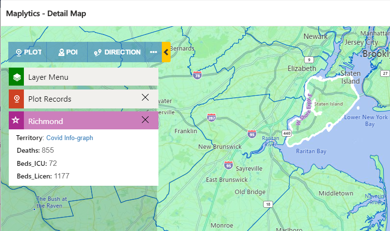
When the user clicks on any shape, the aggregate card will display within this card. If the user wants to see any metadata of shapefile then this can be configured in the summary attribute section. As you can see in the above screenshot, I have added ‘Deaths’, ‘Beds_ICU’, and ‘Beds_Licen’. When I plot this shapefile on the Detail Map and click on the aggregate card, it will open the aggregate card with these three fields of information as shown below.
Note: Users can select a maximum of 6 attributes.
2. Hover Attributes:
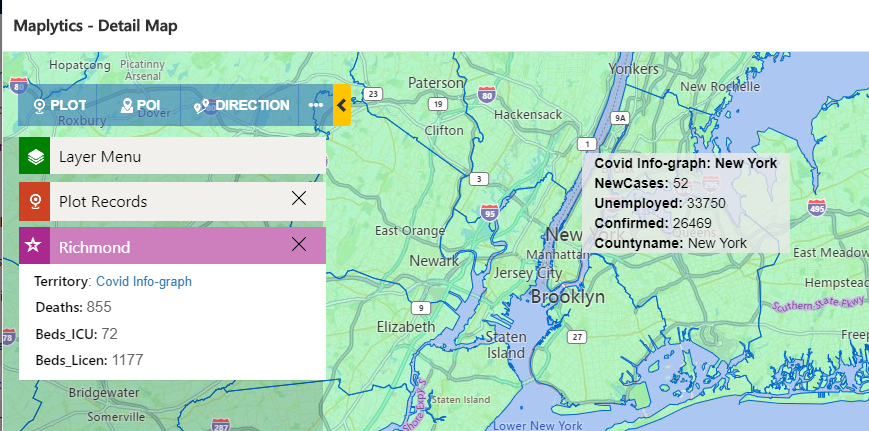
Every time clicking on the shape to visualize the metadata is quite time consuming, if you have a specific requirement and need to quickly check the metadata, you can use the hover attributes. You can add the required metadata to be shown on the hover of any shape. As you can see in the screenshot below, I have configured ‘New Cases’, ‘Confirmed Cases’, ‘Unemployed’, and ‘Area Name’, so that I can assign this area to a suitable salesperson. The hover attributes save time and provide quick and customized information for better resource utilization.
Note: Users can select a maximum of 6 hover attributes.
3. Data grid Attributes:
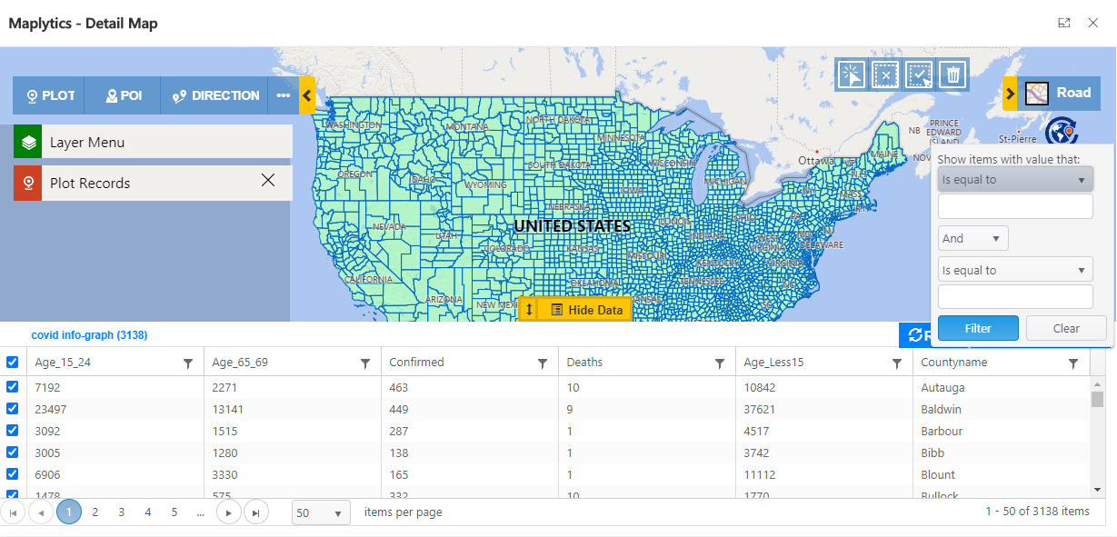
The above two options give you information for only one shape at a time. However, Data Grid allows you to list down all the shapefile records and the total number of shapes within the shapefile. Data Grid also allows you to filter the shapefile records based on different metadata fields.
Category configuration
While plotting the shapefile the default color is green, so to better visualize the data we also provide the option to categorize the color based on different conditions. You can create multiple categories for one field. You can also set the display name for each category as per your requirement.
Let’s see step by step how to create a category configuration:
1. Click on New
2. You will get the option to select attributes for creating the category configuration. Also, you can use the ‘Display Name’ field to set a custom Display Name.
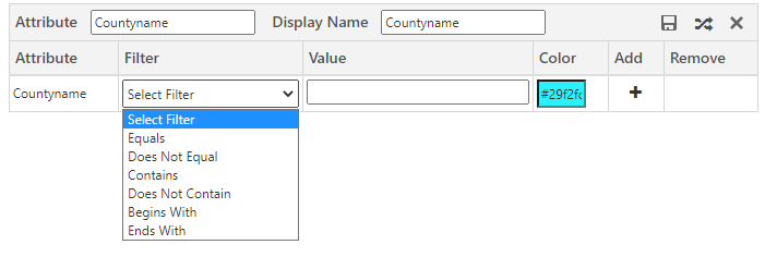
3. After selecting the attributes, based on the attribute’s type, you will get filtration options. In category configuration, you will get 2 different filter options or conditions:
a. For the numeric field, it will give you options as shown below.
b. For other fields, it will give you the options shown below.
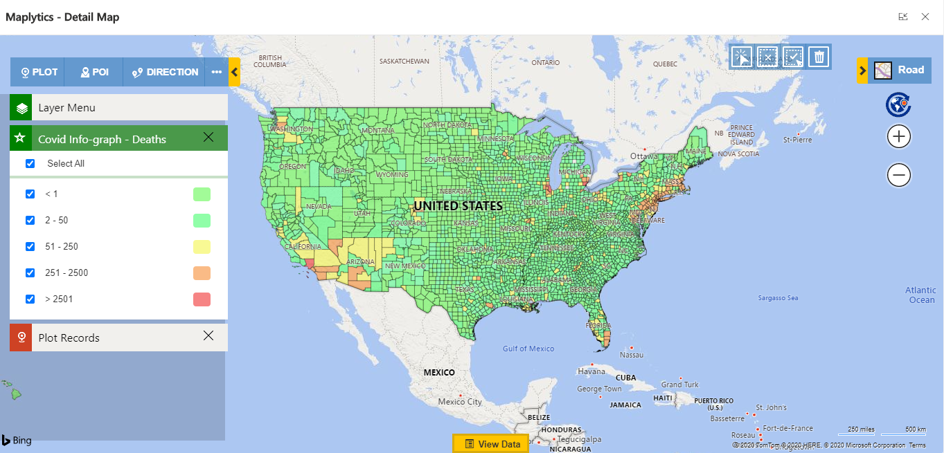
As per my requirement, I want to color-code all the boundaries based on how many deaths happens due to COVID. So I created a category for the Death field. I created the filter criteria as shown below. I also provided colors in which that condition should be displayed on the map. This will help for better visualization and make areas having more death ratio due to COVID easily visible.
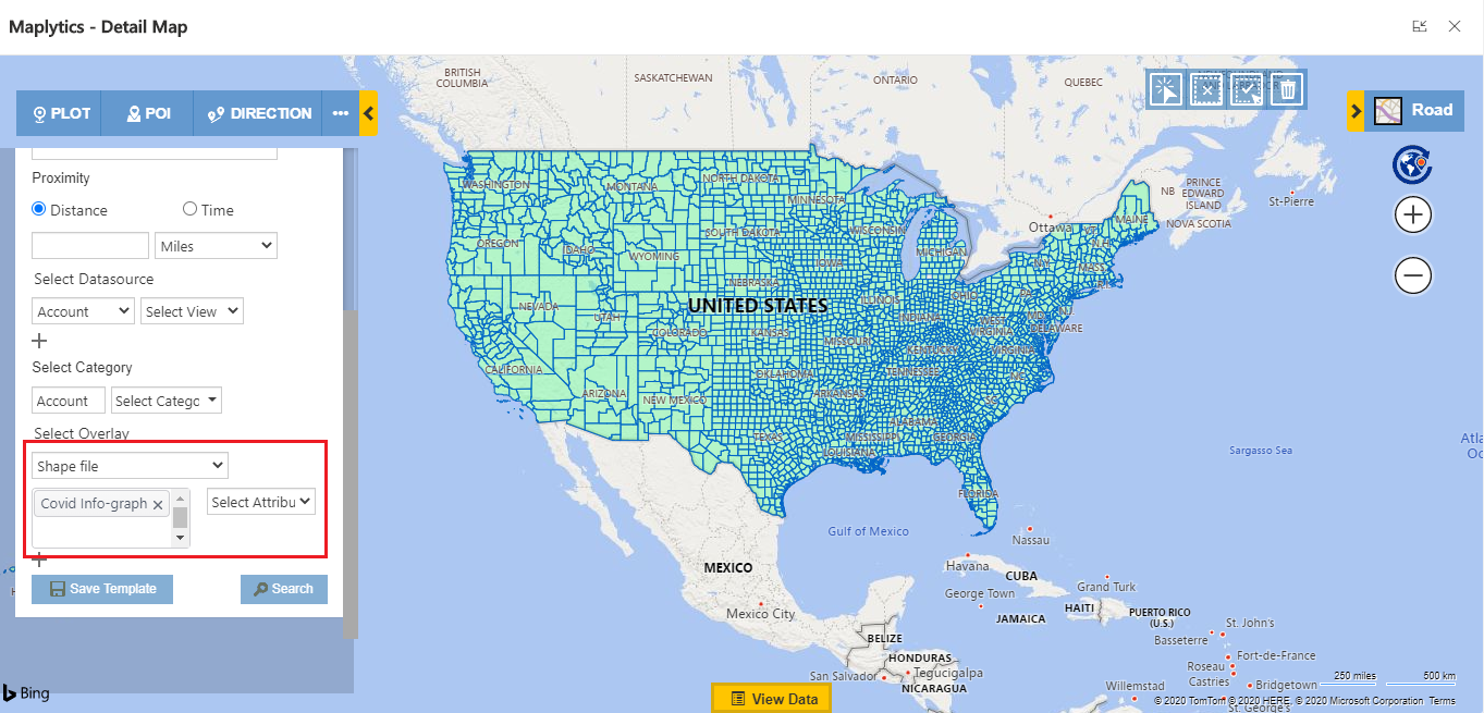
Once I complete the configuration, I open the Detail Map and plot the shapefile as an overlay, with or without CRM data. To plot the census data, follow the steps mentioned below:
Open the Detail Map > Overlay > select the Shapefile records
As shown above, all the shapefile records are plotted in default color. This is because I have not selected the category filed. In the below screenshot, you can see all the boundary is plotted as per the selected category configuration. It will also give you the category card to filter the data.
Conclusion
Using the above mentioned steps, you can easily create and configure the shapefile overlay to start extracting insightful data from your Maplytics visualizations. This was the part one in the two part articles. In the next post, we will further explore the creation and configuration of the shapefile overlay feature, so look out for it.
For more info on how Maplytics is assisting organizations globally with their Geo-Analytics requirement, download the trial from our website or Microsoft AppSource.
Stay Safe!


