In any industry, it is crucial to weigh how the market is doing in every segment and work on the weak points to get the business going with the help of Dynamics 365. For this, it is crucial to visualize data distribution on a map at regular intervals and analyze the same. With the help of data visualization on map, users can not only make relative analysis, but also make out where they need to ramp up their performance through various modes. These modes can be through marketing campaigns, word of mouth or through training modules.
One of the major mapping tool that has been adapted by many organizations is Heat Map. Heat Map is an all-pervasive visualization tool that helps measure the performance of an organization based on multiple criteria. Heat Map + Dynamics 365 CRM proves to be extremely powerful since you are mapping all your sales, service and marketing data and visualizing it on map to figure out strategy that improves business.
Heat Maps is the most popular tool for making comparative analysis of performance of complex areas. Here Maplytics has been able to lend a helping hand to the organizations by including Heat Maps in its list of versatile features that help the business work with diligence. With Heat Maps businesses are able to churn more business by being proactive.
Let’s understand the concept of Heat Maps with the help of a use case. IKL Enterprises is a huge MNC that deals with B2B clients. The clients in return deal with B2C audience. Therefore, Sam from IKL Enterprises wants to visualize how the various industries of his businesses are performing in Staten Island and how the revenue is generated. In order to visualize the data for revenue, they use Maplytics. With Maplytics they plot data with boundary based on postal code and analyze how the business is performing as per different Industries. Maplytics is a trustworthy source since it is Certified by Microsoft Dynamics (CfMD) and is a Preferred Solution on Microsoft AppSource for Dynamics 365 CRM and PowerApps users.
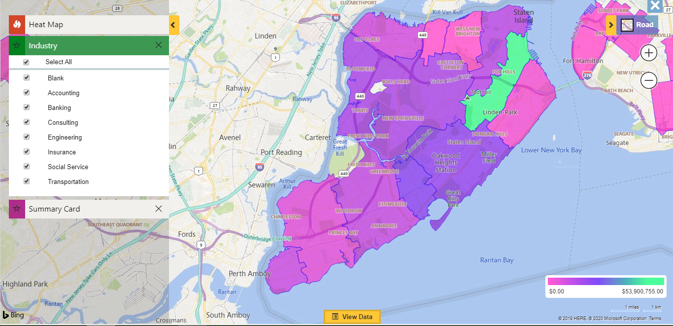
After visualizing data in comparative chart Sam is able to analyze which region is performing well and which regions need to improve their business. Further, since IKL Enterprises has many industrial verticals like Banking, Accounting, Engineering, etc. they need to do a drill down analysis of how every industry is performing in every region relatively. For this Sam plots Heat Map for Pie-Chart analysis.
With Pie-Chart Sam is able to view how each industry is performing in a specific campaign.
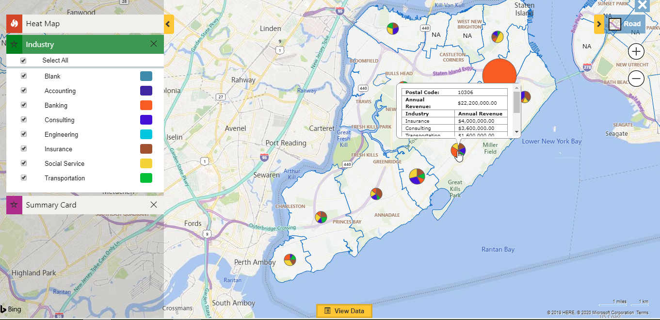
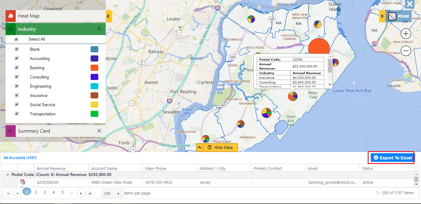
Therefore, Sam is able to make out how each industry is performing in every region and take required steps to improve the performance. Further, if Sam wants she can export the data in excel format in order to keep a track and for more in-depth analysis.
Thus, you have seen how with the help of Heat Maps, Sam was not only able to do a relative analysis but also fetch concrete data for the same. He can transfer this data to Marketing team to launch campaigns or else use this data for figuring out how to train the teams for better performance.
For a comprehensive list of Maplytics features visit this space. To start using Maplytics for Heat Map or any other feature download Maplytics for a free trial of 15 days from Website or Microsoft AppSource.
We will be back with another informative blog soon, till then, Happy Mapping!


