Any business depends on its data and numbers. Heat Maps is one of the most apt features for analysis of this data. You can take either of the two approaches while you are doing statistical analysis – number crunching, or pictorial representation. Number crunching may become a little daunting because of the huge chunk of data businesses deal with. On the other hand, graphical representation in Heat Map is what you can visually connect to without much hustle.
Heat Map is an extremely powerful feature for geo-locational analysis of Dynamics 365 CRM data. It is mostly used for business intelligence data-analysis. Maplytics summarizes Dynamics CRM data and creates insightful geographical Heat Map visualizations for quick decision making.
We have been continuously enhancing Heat Maps to intelligently help you analyze your large and complex Dynamics 365 CRM data.
In our new October 2018 release we have gone ahead and introduced two new features in Heat Maps viz. Pie chart and Column chart. It was hosted for advanced evaluation of Dynamics CRM data because even most groundbreaking changes in statistics look bland if written in plain text. Thus, to analyze data by the managers and users in a more appealing and understandable way, we concentrated on using a new method and settled on introducing charts for Heat Maps.
See it in action:
Let’s dive deep and know how these two new features have added to the credibility of Heat Maps – for Dynamics 365 CRM:
Pie Chart:
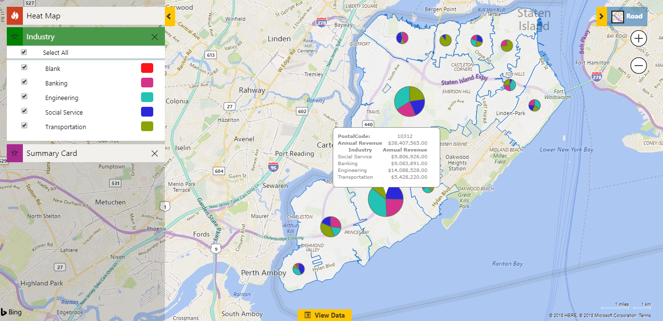
A pie chart is a circular data graphic, which is segregated into portions to illustrate numerical proportion in Heat Maps. This new released feature of Maplytics is being extensively used in presentations and offices by Field Reps and Marketing teams. Pie Chart helps show proportions and percentages between categories. This provides a strong base to analyze data through Heat Maps within Dynamics 365 CRM.
Here are a few pointers how the functionalities of Pie Chart helps you analyze your Dynamics 365 CRM data:
Easy Evaluation of Data Spread:
Pie Chart provides a pictorial representation of analyzed data in Dynamics CRM. It is easily comprehensible due to its visual nature. The evaluation of data through pie chart within Dynamics CRM is robust and helps in decision making by our users, peers and Partners.
Powerful Comparative Data Analysis:
Pie chart displays data in graphic form in Heat Maps – for Dynamic CRM. Every segment of Pie chart defines the area it covers with respect to other segments. This data distribution makes comparison of heat density exceptionally powerful and enables better use case review.
Empowers Heat Maps:
Illustrative study of data is effortless in Pie chart within Dynamics CRM. Though, Pie chart doesn’t show the exact count, its relativity is extraordinary which aids distinctly in visualizing the comparison. You can readily analyze how other regions in a Heat Map are doing and come up with an apt solution to leverage your business.
Can be located on a base map:
The function of base map is to provide background detail necessary to orient the location of the map. It also adds to the aesthetic appeal of the system. Pie chart drawn here can help in evaluating geolocation data in real time to analyze data points easily in Heat Map for Dynamic CRM.
Column Chart:
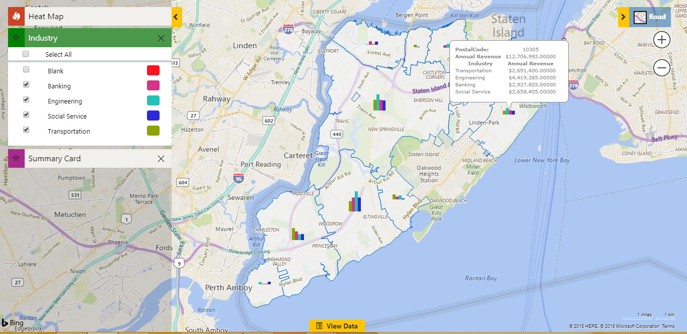
A column chart is a vertical rectangular graphic representation of data where the length of the bar is proportional to the data value. The bars flow across the chart horizontally with the data displayed on the left axis in Heat Maps for Dynamic CRM. In our latest release we have made this effort to make your work easier with visual display.
We have already seen the advantages of pie-chart above, now let’s have some insight into how Column charts are viable for us:
Easy to comprehend:
Charts have been an all-time favorite mode to represent statistics. When it comes to Heat Maps within Dynamics CRM, this graphical representation can aid the sales and marketing teams to visualize targets more effectively by comparison of data. It enables you to break patterns and arrive at a feasible outcome that may help in yielding better results.
Mapping changes over time:
An advantage of column charts is, it does analysis of data that changes over geographies. For instance the annual revenue of a country might be low for certain region for a specified period of time but it might shoot up for another period. Here we can do relative analysis of the periods using column charts – the new feature of Heat Maps within Dynamics CRM.
Estimates can be made quickly and accurately:
Column chart directly deals with numbers. It provides exact count for the statistics. This study helps the pattern and enables you to predict the future market based on estimation. This feature within Heat Maps is called Predictive Analysis.
Accessible to wide audience:
Given the simplistic nature of Column chart even a layman can understand its representation. Column chart gives room for better analysis and even the alterations in the statistics becomes readily comprehensible within Dynamics CRM.
These new add-ons, Pie Chart and Column chart, in Heat Map – for Dynamics CRM – are used to graphically distinguish the density of data splattered over a pre-configured area.
So, what are you waiting for – Download FREE trial of Maplytics from our Website or from Microsoft AppSource!
Happy Mapping!


