Maplytics was recently updated with some new features prominently for field reps. But, as with every release, our core focus is on improving user experience to make the mapping experience as seamless for you as possible. We have already written two use cases on Check-In feature for Sales and Service reps. This blog is on simple, but very profound features viz. Show Labels, Territory List and Highlight Pushpins.
As our business grows, so do our clients and prospects, so the deeper and clearer our vision is the lesser time required to make better decisions. For this, we have improved the visual experience of our users in this update. This may seem like a very small update, but when put into implementation saves surprisingly large amount of time. Let’s see how these two features help in bringing in-depth insights into your business.
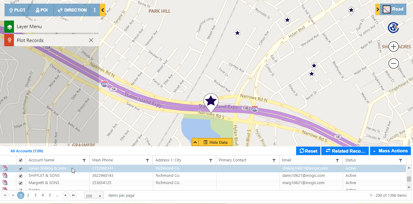
Show/Hide Labels
As the name suggests, this new addition in the list of features enables users to view all pushpins, regions, and territories on the map together along with labels. For instance say you plot data with all Accounts, Contacts and Territories together on map in Dynamics 365 CRM. Now, in order to view the labels (names) of each of these pushpins, you might have to hover over the pushpin or territory to view their names. With Show Label feature, these labels can be shown or hidden depending on the requirement.
In case you want to view the Accounts, Contacts and Territories, you can do so by clicking on the Show Label ![]() button on Layer Menu to view the labels of these pushpins and territories.
button on Layer Menu to view the labels of these pushpins and territories.
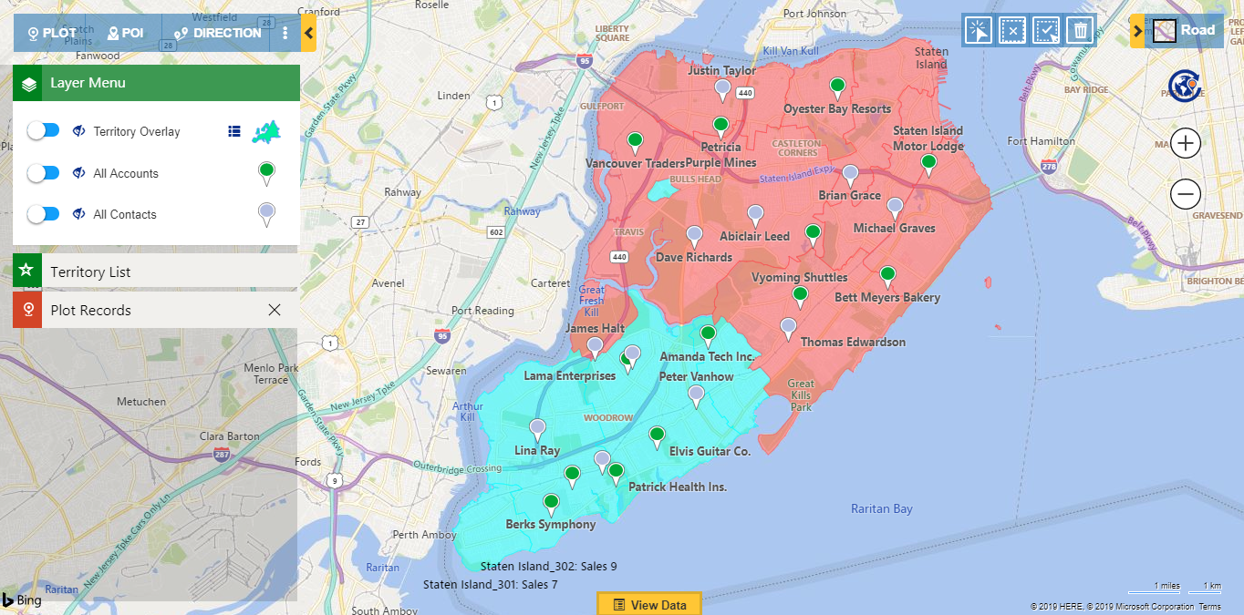
In case you want to hide these pushpins for Account and Contact and view only territories labels, click on Hide Label ![]() button on Layer Menu for Account and Contact. Showing/Hiding labels is available for every individual layer of data plotted on the map except for Drawing layer.
button on Layer Menu for Account and Contact. Showing/Hiding labels is available for every individual layer of data plotted on the map except for Drawing layer.
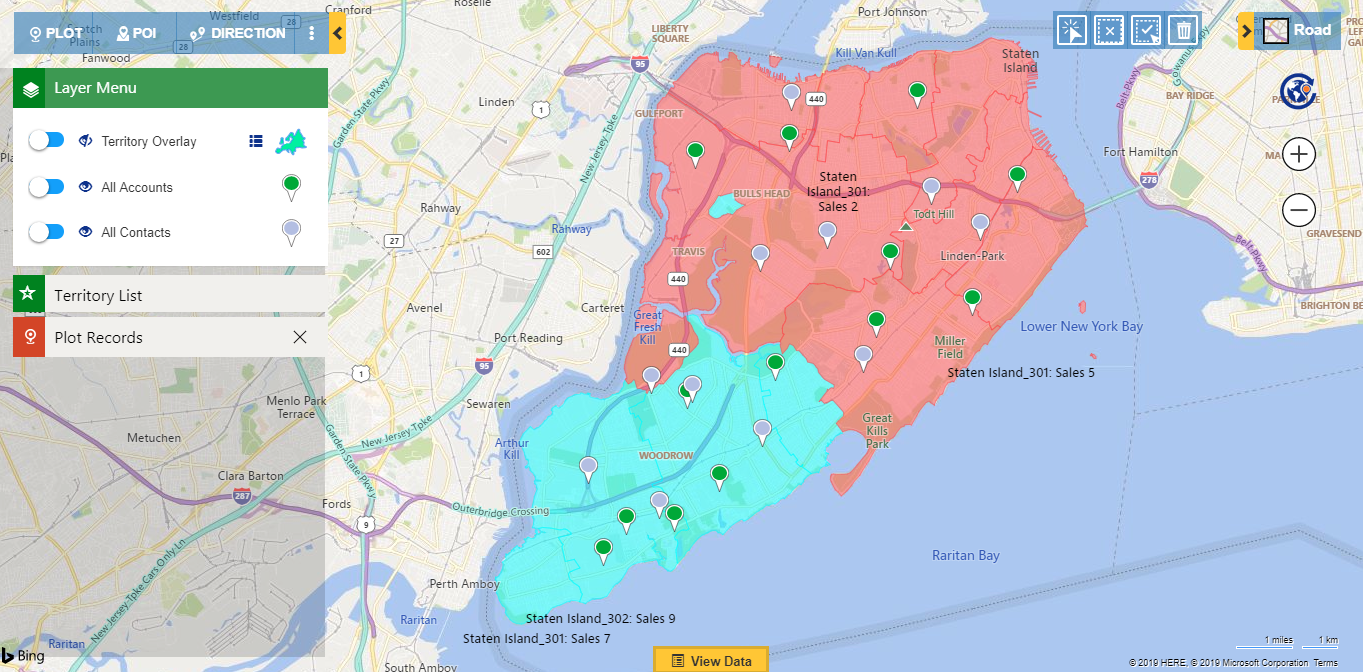
Likewise, labels of the records of any entity, territory or region can be Hidden or Shown by clicking on the Hide/Show Label icons. By default, the labels are hidden.
Note: Show/Hide Label button is visible only when number of records plotted on map is less than 5000.
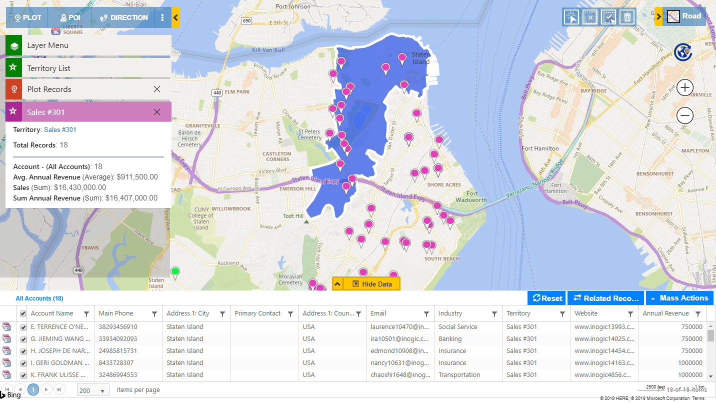
Territory List
Maplytics has also introduced Territory List with July update. With this, you can view the list of all the territories under Territory List card. For instance, say that few geographies lie under multiple territories, in this case, it would be difficult to visualize distinct boundary of each territory as they overlap. The Territory List can be seen easily by clicking on Show List button.
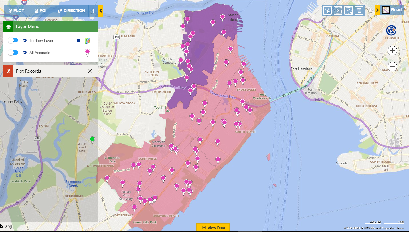
In the above scenario Jessica, the area manager of Staten Island wants to view the revenue of Sales and Service territories under her supervision. Since the boundary of Sales Territory overlaps on Service Territory, she cannot click on them to view the revenue for each territory individually. For this, she can select the territory from Territory List for which she wants to see the revenue as shown below.
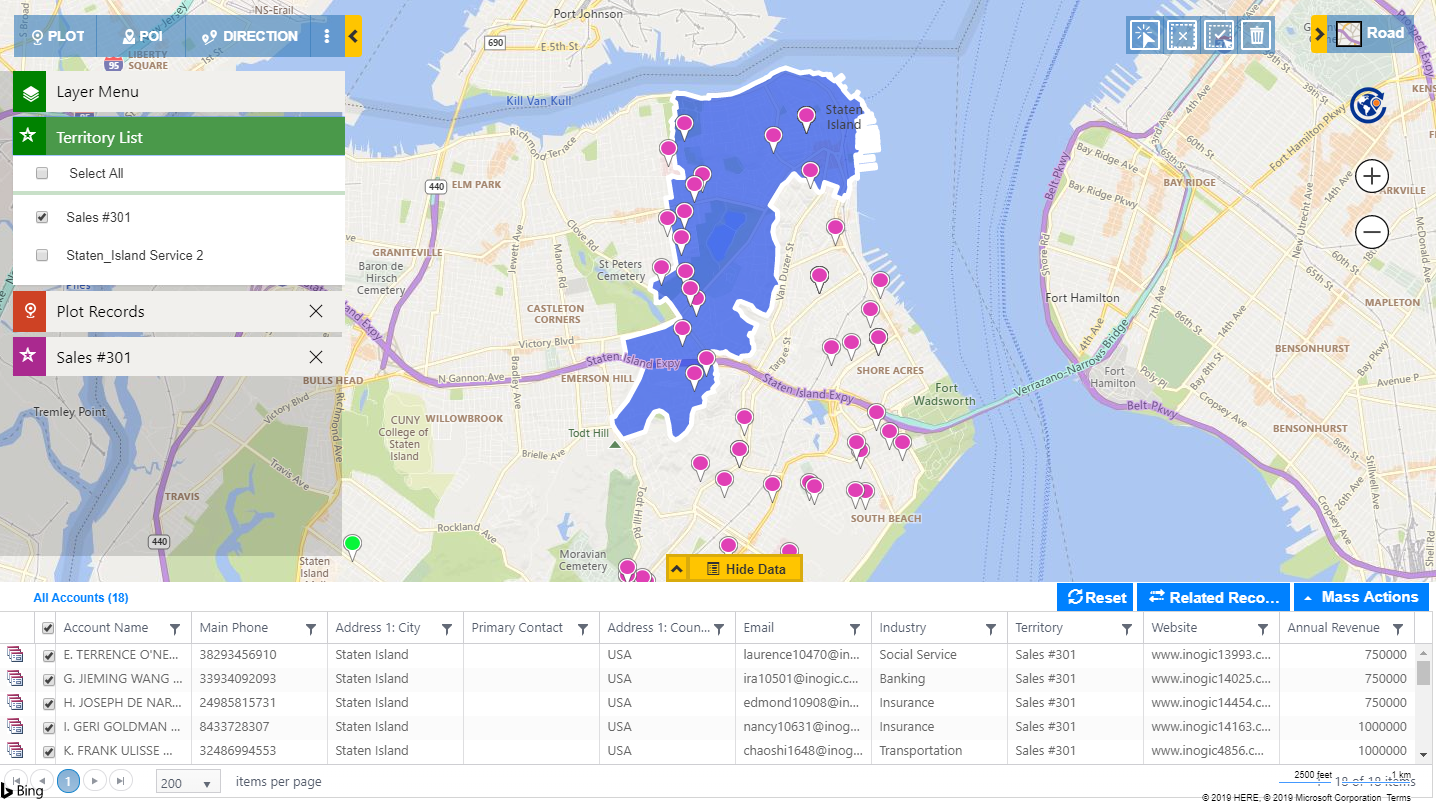
She can view the revenue by clicking on the territory and this would open the Aggregate Card with all the details. Here she can see the number of Accounts in the territory, Average Revenue, Total Sales and Total Revenue based on Entity Map Configuration.
Similarly, she can select the Service Territory in Territory List and view its revenue. At any point, the territories that need to be analyzed can be highlighted by selecting them in Territory List.
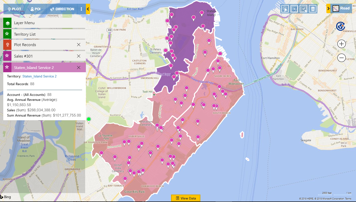
Jessica can also open any territory from Aggregate Card to make any changes by clicking on its link. Thus, with this feature, overlapping territories can be analyzed with ease.
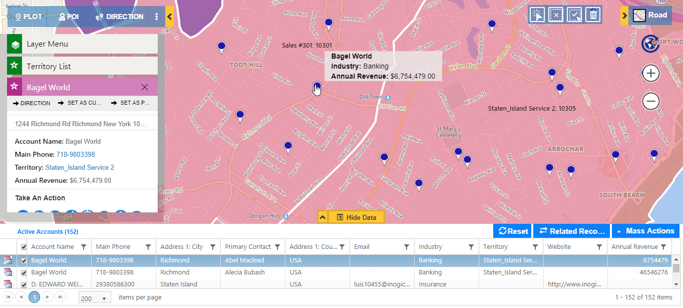
Highlight Pushpins
Since the amount of data plotted on the map in Dynamics 365 CRM is large, sometimes finding your desired pushpin on map can be a bit time-consuming. Like Show Labels, Highlight Pushpins has also been introduced to reduce the time spent in viewing data on map. Jessica can easily highlight the pushpin for any Sales or Service account by clicking on the record on View Data Grid.
With this feature, she can also view the details of any pushpin by just clicking on it. This will highlight the details of the pushpin’s row in View Data Grid with all the details mentioned like email, address, industry, etc.
Thus you have seen how using these simple features you can save huge amount of time and strategize better and quickly.
Maplytics believes in making your mapping experience seamless to stay ahead in your business. You can explore the extensive list of mapping features of our new release here.
Also, download Maplytics for a free trial of 15 days from our Website or Microsoft AppSource. Chime in at crm@inogic.com for any of your mapping needs.
Enjoy your mapping experience!