#CustomersForLife
Heat Map Visualization in Dynamics 365 CRM
Did Rick just save us 30 min of meeting time?
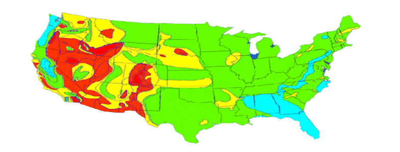
“That ladies and gentlemen is the annual revenue per region. As we can see, our hottest region with the highest revenue is shown in red. As we go down the temperature scale on the color palette, so does the annual revenue generated in those regions. Greens indicate the lowest revenue generators. Any questions?” Rick looked around the management panel after finishing a record presentation in 30 minutes.
How did Rick manage such a smart presentation?
Well, he used graphical elements in his presentation for easier visualization.
… and how did he represent the Annual Revenue comparison with numbers?
with Heat Maps within Microsoft Dynamics 365 CRM
Curious? Wish to know more? Come, let’s explore…!
Maplytics, an app from Inogic integrates Bing Maps with Dynamic 365 CRM for data analysis. This results in opening up a vast opportunity for Microsoft Dynamics 365 CRM users, peers, and Partners to analyze graphic data using Heat Map. Heat Map in Microsoft Dynamics 365 CRM brings forth a comparative study of records by studying their density over a region. Graphic distribution of leads and other entities across different geographical areas helps to foresee the vital areas to focus on.
Working with colors
Colors codes denote the saturation of customers over a particular spread. A mere zoom in or out directs you to regions that have major potential. Heat Map in Microsoft Dynamics 365 CRM lets you dive deep into the market geography. The default colors in Heat Maps are red, green, and yellow which can be altered depending on business demand.
Ways to visualize Heat Maps
You can also visualize a Heat map within Microsoft Dynamics 365 CRM in context to boundary, no-boundary, Pie-chart, and Column-chart. Boundary analysis lets you create Heat Maps with regions while a no-boundary option is without any region and has no geographic boundaries. Heat Map enables you to view data based on the density of measure and analyze the data covering the geographical spread.
Pie Charts and Column Charts
A pie chart is a circular data graphic, which is segregated into portions to illustrate numerical proportions in Heat Maps within Microsoft Dynamics 365 CRM. The pie chart analyzes heat density for a given set of categories most commonly in percentage. It is used extensively in presentations by the sales team to show data distribution. Similarly, a column chart is a vertical rectangular graphic representation of heat where the length of the bar is proportional to the data value. This comparative analysis of data over areas inspires the user to take better decisions.
Rick, the smarty-pants
So, Rick’s smartly swapped the figures of the annual revenue from his lengthy presentation with screenshots of heat maps. Where he would have spent hours explaining the numbers, he displayed them with better graphical analysis within minutes. Next time you have a presentation, be like Rick, and use Heat Maps!
FAQ's

Can I get Heat Maps based on attribute in Dynamics 365 CRM?
Yes, Maplytics allows you to get Heat Maps based on Dynamics 365 CRM attribute that is termed as measure in the map. With this you can easily plot the Heat Map with different aspects.
Can I download Heat Maps plotted in Dynamics 365 CRM?
Yes, with the help of Maplytics users are able to not just visualize Heat Maps in Dynamics 365 CRM but also download the plotted Heat Maps.
Can I get summary of certain region defined by boundary in Dynamics 365 CRM?
With Maplytics, by clicking over a certain area on the heat map shows the summarized information of the same.
How can I view Heat Map based on charts in Dynamics 365 CRM?
Maplytics allows you view density of data spread with the help of Pie/Column charts. Charts help the users to analyze the Dynamics 365 CRM data on the basis of comparative data shown by the charts on the map.
How can I visualize Heat Map spread on map in Dynamics 365 with boundaries?
Maplytics enables you to visualize Heat Map in different ways. You can view Heat Map based on boundaries with regions like City, Postal Code, Country, etc. defined for Dynamics CRM data. Also, you can view the data spread with No Boundary or Pie/Column Chart.


